Your bedroom should feel calm the moment you enter it. But sometimes, even after choosing comfortable furniture, soft lighting, and good décor, the room still feels mentally “active” or slightly stressful. In many homes, the bedroom colour plays a bigger role in this than people realise.
Certain bedroom colours can make a room feel softer, quieter, and more sleep-friendly, while others may overstimulate the mind and affect relaxation before bedtime. That’s why choosing the right bedroom wall colour is not just about aesthetics — it can directly influence how calm, comfortable, and restful your bedroom feels at the end of the day.
Colour psychology, lighting conditions, room size, paint finish, and even warm or cool undertones can all affect the mood of your bedroom. A shade that looks calming in a showroom may feel too bright, cold, or harsh inside a real bedroom with artificial lighting.
In this guide, we’ll explore the best bedroom colours for sleep, practical colour combinations, colours to avoid, and expert tips to help you create a more relaxing and sleep-friendly bedroom environment in your home.
Does Bedroom Colour Really Affect Sleep?
Yes — to an extent, your bedroom wall colour can influence how relaxed or mentally stimulated you feel before sleep.
This does not mean wall paint alone can “cure” poor sleep. Factors like lighting, noise, stress, screen exposure, mattress quality, ventilation, and room temperature usually have a much bigger impact. However, bedroom colour psychology does affect visual comfort and emotional perception, which can indirectly help your mind feel calmer at the end of the day.
In general, cool and muted shades create a more relaxing visual environment compared to highly saturated or overly bright colours. Soft blues, greens, earthy neutrals, and gentle warm tones tend to reduce visual stimulation, making your bedroom feel quieter and more restful.
On the other hand, intense colours like bright red, neon orange, or overly sharp white can make a room feel more energetic than relaxing— especially under artificial lighting at night.
Most sleep-friendly bedrooms usually follow a few simple visual principles:
low visual stress
soft light reflection
balanced warm or cool undertones bedroom wall colours for sleep
This is why relaxing bedroom wall colours often feel softer, slightly muted, and less reflective compared to bold decorative colours commonly used in living rooms or commercial spaces.
What is the most relaxing bedroom colour for sleep?
Soft blue, sage green, muted beige, warm greige, and off-white are considered some of the best bedroom colours for sleep because they create a calmer and less visually stimulating environment. These shades also work well with warm lighting commonly used in modern bedrooms.
Best Bedroom Colours for Better Sleep
The best bedroom colours for sleep are usually soft, muted, and visually sleep-friendly. Instead of choosing trendy shades aggressively promoted by paint brands, it is often better to focus on colour families that feel timeless and peaceful in real-life bedroom conditions.
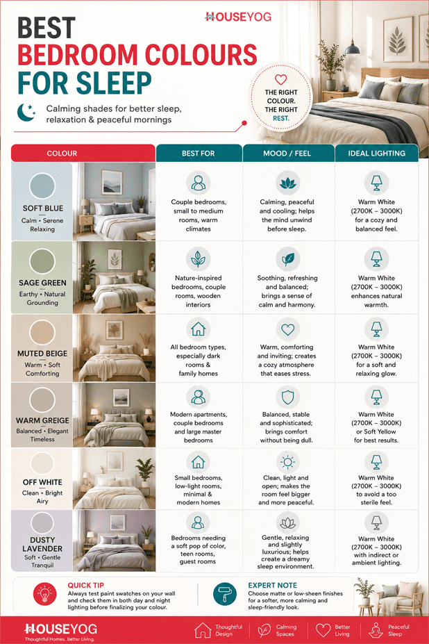
Soft Blue
Soft blue is one of the most popular calming bedroom colours for sleep and peace. It creates a cool, airy feeling that works especially well in warm Indian climates.
Unlike darker blues, soft powder blue or dusty blue feels lighter on the eyes and reduces visual heaviness in the room. If your bedroom receives good natural light during the day, this colour can make the space feel fresh and relaxing without appearing too bright.
Soft blue pairs beautifully with white ceilings, light wooden furniture, linen fabrics, and warm LED lighting. It works especially well in modern apartments, minimalist bedrooms, and small to medium-sized rooms where you want the space to feel visually open.
A matte or eggshell finish usually gives the best result because glossy blue walls can reflect excessive light at night.
Sage Green
Sage green has become one of the most recommended sleep-friendly bedroom colours in recent years, and for good reason. Inspired by natural tones, it creates a grounded and restful atmosphere without feeling dull or heavy.
If you want your bedroom to feel calm but still slightly warm and inviting, sage green is often a safer choice than cooler greens. It works beautifully with wooden textures, indoor plants, cane furniture, beige curtains, and warm lighting.
This colour is especially suitable for couple bedrooms, nature-inspired interiors, and bedrooms with wooden flooring. In Indian homes, sage green also works surprisingly well with warm white lighting setups commonly used in false ceilings and bedside lighting.
If you enjoy nature-inspired interiors, adding a few sleep-friendly indoor plants can further improve the calming atmosphere of your bedroom.
Warm Greige
Greige — a balanced mix of grey and beige — is an underrated choice for calming bedroom colours. Pure grey can sometimes feel cold, while beige alone may appear too traditional. Warm greige creates a softer and more balanced look that feels modern without becoming visually harsh.
One reason this colour works so well in Indian bedrooms is its adaptability. It performs nicely under both natural daylight and artificial warm lighting, which makes it easier to maintain a consistent mood throughout the day.
If you prefer timeless interiors over trendy décor styles, warm greige is one of the safest bedroom wall colours for relaxation. It pairs particularly well with upholstered headboards, wooden wardrobes, textured curtains, and layered ceiling lighting.
Dusty Lavender
Lavender is often associated with calmness, but very bright purple shades can sometimes feel visually heavy inside a bedroom. Dusty lavender, however, feels much softer and more relaxing.
This shade works especially well if you want a subtle hint of colour without making the room feel loud or overly decorative. It creates a peaceful atmosphere while still adding personality to the space.
Dusty lavender looks particularly elegant in compact urban apartments, bedrooms with soft fabric textures, and spaces that use warm, indirect lighting instead of bright tube lights.
Muted Beige
Muted beige remains one of the most practical and timeless good bedroom colours for sleep. It creates warmth without excessive stimulation and works comfortably across almost every interior style.
Compared to bright cream shades, muted beige feels softer, calmer, and more mature. It also handles dust, lighting variation, and future furniture changes much better over time, which makes it a very practical choice for Indian homes.
If your bedroom has limited daylight or you want a low-maintenance colour palette that will not go out of style quickly, muted beige is often a very safe option.
Soft Grey
Soft grey works beautifully when used carefully. The key is choosing warmer grey tones instead of cold industrial greys that can make a bedroom feel emotionally distant.
Warm soft grey creates a clean and minimal bedroom atmosphere without feeling sterile. It works especially well with layered lighting, fabric upholstery, wooden accents, and soft textures.
This is one of the best light colours for bedroom interiors if you prefer a modern and contemporary look. However, in compact bedrooms, it is usually better to avoid very dark grey shades because they can make the room feel visually heavy.
Off White
Off-white is often underestimated in discussions around soothing paint colours for bedrooms. While stark, bright white can sometimes feel harsh under artificial lighting, softer off-white shades create a cleaner and more peaceful atmosphere.
If your bedroom is small or receives limited daylight, off-white can help the space feel brighter and visually larger without becoming overly reflective.
This colour works beautifully with warm lighting, textured fabrics, wooden furniture, and minimalist décor. For best results, it is usually better to choose warmer undertones instead of cool, hospital-like whites.
Pale Earth Tones
Soft, earthy shades inspired by clay, sand, stone, or muted terracotta create a grounded and emotionally warm bedroom environment.
These colours are becoming increasingly popular in modern Indian homes because they feel natural, comforting, and visually balanced without appearing too decorative.
Pale earth tones work especially well in bedrooms that use natural materials, warm ambient lighting, textured fabrics, or earthy décor elements. If you prefer a relaxed and low-stress atmosphere over sharp modern contrasts, these shades can work beautifully.
Bedroom Colours to Avoid for Better Sleep
While there is no universal “bad” bedroom colour, some shades can feel more visually stimulating than calming— especially at night when your mind is trying to slow down before sleep.
This does not mean you should never use bold colours in your home. However, if your goal is to create a calm and sleep-friendly bedroom, it is usually better to avoid colours that feel overly bright, harsh, or emotionally intense across large wall surfaces.
Bright Red
Red is energetic, bold, and emotionally intense. While it can work beautifully as an accent colour, excessively bright red on bedroom walls may increase visual stimulation and make the room feel more active than peaceful.
If you personally enjoy red tones, it is often better to use them through cushions, artwork, décor accents, or fabric elements instead of painting the entire room red.
Neon Orange
Highly saturated orange shades may feel playful and energetic initially, but they can become visually tiring over time — especially under artificial lighting at night.
In most homes, neon orange works better in activity-focused spaces like gyms, cafés, gaming rooms, or creative studios rather than sleep-focused bedrooms.
Harsh Black
Dark black walls may look dramatic and luxurious in photographs, but in real bedrooms, they often absorb too much light and create a visually heavy atmosphere.
In compact Indian bedrooms, excessive black can make the room feel smaller, darker, and slightly closed in. If you like darker interiors, softer charcoal or warm grey tones are usually easier to live with.
Intense Purple
Deep purple shades can sometimes feel luxurious, but highly saturated purple walls may also feel mentally overwhelming in a bedroom environment.
Softer versions like dusty lavender or muted mauve usually create a calmer and more balanced atmosphere without losing the elegance associated with purple tones.
Overly Bright White
Bright pure white may look clean at first, but excessive brightness and reflection can sometimes make a bedroom feel harsh — especially under cool white LED lighting.
This is why many designers now prefer warmer off-white tones for bedrooms instead of stark white shades. Softer whites generally create a more relaxed and comfortable atmosphere, particularly during the evening.
Best Bedroom Paint Finish for a Calm Feel
Paint finish can affect how a bedroom colour actually feels inside the room. Even a calming shade may appear uncomfortable or visually harsh if the surface reflects too much light.
This is why choosing the right paint finish matters almost as much as choosing the colour itself.
For most bedrooms, matte or low-sheen finishes usually work best because they soften light reflection and create a more relaxed visual texture. These finishes also help bedrooms feel warmer, quieter, and less visually “busy” at night.
Matte Finish
Matte finishes absorb light gently instead of reflecting it sharply, which helps create a softer and more calming atmosphere. They work especially well with calming bedroom colours like soft blue, sage green, muted beige, dusty lavender, and other pastel or earthy shades.
If your bedroom uses warm ambient lighting, layered ceiling lights, or indirect lighting near the bed, matte walls usually create a much more comfortable mood compared to glossy surfaces.
Another practical advantage is that matte paint tends to hide small wall imperfections better, which makes it a popular choice for modern Indian bedrooms.
Avoid Excessive Gloss
Highly glossy walls reflect tube lights, LED strips, and daylight much more aggressively. As a result, the bedroom may feel visually active instead of calm — especially during the evening.
While glossy finishes can work well in kitchens, bathrooms, or decorative accent areas, they are usually less suitable for peaceful sleeping spaces.
If you still want a slightly smoother finish for easier cleaning, an eggshell or low-sheen finish is often a better compromise than high gloss.
How Lighting Changes Bedroom Paint Colours
One of the biggest mistakes people make while choosing bedroom paint is ignoring how lighting affects colour inside the room.
A shade that looks soft and calming in a paint catalogue or showroom may appear completely different once it is applied on your bedroom walls. Natural daylight, LED colour temperature, room direction, ceiling lighting, and even curtain fabrics can all influence how a colour finally looks and feels.
This is why some bedrooms feel warm and comfortable, while others feel unexpectedly cold, dull, or visually harsh even with similar paint shades.
Warm Light vs Cool White Light
Lighting temperature plays a major role in how bedroom colours appear at night.
Warm white lighting usually makes colours like beige, sage green, earthy tones, warm grey, and dusty blue feel softer and more comfortable. These combinations often create a calmer atmosphere that supports relaxation before sleep.
Cool white lighting, on the other hand, can sometimes make certain colours appear sharper, brighter, or colder than expected. In bedrooms, this may reduce the soft and restful feeling many homeowners are trying to create.
If your goal is a peaceful and sleep-friendly bedroom environment, warm white lighting is usually the safer and more comfortable choice.
North-Facing vs South-Facing Bedrooms
Room direction can also affect how paint colours behave throughout the day.
North-facing bedrooms generally receive cooler natural light, which means overly cool paint shades may sometimes feel slightly dull or cold. In such rooms, warmer tones like muted beige, warm greige, or soft earthy colours often feel more balanced.
South-facing bedrooms receive stronger daylight for longer durations, so cool colors for bedroom walls — like soft blue or sage green — usually appear more balanced and refreshing.
How Colours Behave in Small Bedrooms
In compact bedrooms, colour depth becomes even more important because darker shades can visually shrink the space, especially if natural light is limited.
This is why bedroom colours for small rooms are usually lighter, softer, and slightly muted rather than very dark or highly saturated. Shades like off white, pale beige, soft grey, or dusty pastel tones can make the room feel visually open without creating a sterile or overly bright atmosphere.
Practical tip:
Before finalising a bedroom colour, it is usually a good idea to test a sample patch under both daytime and nighttime lighting conditions.
Best Bedroom Colours According to Room Type
The best bedroom colour also depends on the type of room you are designing. Factors like room size, natural lighting, age group, lifestyle, and furniture style can all influence how a colour finally feels inside the space.
A shade that looks calm and balanced in a large master bedroom may feel too dark in a compact apartment bedroom. Similarly, colours that work well for elderly parents may not feel suitable for modern urban interiors or kids’ rooms.
Instead of choosing colours only based on trends, it is usually better to think about how the room is actually used every day.
Best Bedroom Colour for Couples
For couple bedrooms, colours that feel balanced, warm, and emotionally calming usually work best. Warm greige, sage green, muted beige, and dusty blue are popular choices because they create a mature and restful atmosphere without feeling overly decorative.
These colours also pair well with layered lighting, upholstered headboards, wooden furniture, and modern wardrobe finishes commonly used in Indian homes.
If you are designing a couple bedroom, you may also like these romantic bedroom colour ideas that create a warm and cozy atmosphere.
Bedroom Colours for Small Rooms
In compact bedrooms, lighter and softer shades generally work better because they help the room feel more open and visually breathable.
Off white, soft beige, pale grey, and light sage green are some of the best bedroom colours for small rooms because they reflect light gently without creating a harsh or sterile look.
Using matte finishes and warm lighting can further enhance the sense of comfort in smaller spaces.
Best Bedroom Colors for Dark Rooms
Bedrooms with limited natural light usually benefit from warmer and softer paint colours instead of dark cool shades.
Muted beige, warm greige, soft earthy tones, and warm off-whites can help dark rooms feel brighter and more welcoming without becoming excessively reflective.
If your bedroom receives very little daylight, it is generally better to avoid deep grey, dark blue, or black-heavy colour palettes.
Bedroom Colours for Elderly Parents
Bedrooms designed for elderly parents usually feel more comfortable with softer and low-contrast colours that reduce visual strain.
Warm neutrals, pale greens, muted beige, and gentle earthy tones often create a calmer and more restful atmosphere. These shades also work well with warm lighting and traditional wooden furniture commonly found in Indian homes.
Avoid overly bright or highly contrasting colours, especially in compact bedrooms.
Kids Bedroom Colours
Many parents choose very bright colours for kids’ bedrooms, but highly saturated shades can sometimes feel visually overstimulating — especially near sleeping areas.
Softer pastel tones like muted blue, sage green, pale peach, dusty lavender, or warm off-white usually create a calmer sleeping environment while still keeping the room cheerful and inviting.
The goal should be creating a space that feels playful during the day but calming at night.
Best Bedroom Colour According to Vastu and Sleep
Many homeowners prefer light earthy tones, soft green, light blue, or muted beige for bedrooms because these colours are often associated with calmness, emotional balance, and relaxation in Vastu-inspired interiors.
Even from a practical design perspective, these softer shades tend to create a more peaceful atmosphere compared to highly saturated or visually aggressive colours.
If you follow Vastu principles while designing your home, choosing calm and balanced colours for the bedroom is usually considered more suitable for rest and emotional comfort.
If you are unsure about using a single colour throughout the bedroom, combining soft complementary tones can often create a more balanced and visually calming atmosphere.
In most modern Indian homes, the most successful bedroom colour combinations are usually the ones that feel soft, layered, and easy on the eyes rather than highly contrasting or overly dramatic.
Here are a few peaceful bedroom paint ideas that work particularly well for sleep-friendly interiors:
Sage green walls with an off-white ceiling and natural wooden furniture for a calm and earthy look
Dusty blue walls paired with warm white lighting and beige curtains for a soft and airy bedroom feel
Warm greige walls with walnut wood textures and fabric upholstery for a modern yet cozy atmosphere
Off-white walls combined with pale earthy décor accents for a clean and visually light bedroom
Soft beige walls with matte black minimal décor elements for a warm contemporary look
Pale lavender walls with warm fabric textures and indirect lighting for a softer and more elegant mood
The key is maintaining visual softness throughout the room. In most bedrooms designed for relaxation, softer transitions between wall colours, lighting, furniture, and fabrics usually feel more comfortable than sharp high-contrast combinations.
Final Thoughts
The best bedroom colours for sleep are not always the trendiest shades on social media or the most eye-catching options in paint catalogues. In real homes, the most effective bedroom colours are usually the ones that feel visually calm, emotionally balanced, and comfortable under everyday lighting conditions.
Soft blues, sage greens, muted neutrals, earthy tones, and warm off-whites generally work well because they reduce visual stress and create a more peaceful atmosphere for relaxation.
Instead of focusing only on fashionable paint shades, it is often more helpful to think about how your bedroom actually feels at night.
Does the lighting feel soft and comfortable?
Do the walls feel visually calm after a long day?
Does the room help your mind slow down before sleep?
That overall feeling matters far more than trendy colour names or showroom-style inspiration photos.
If you are planning a bedroom makeover or designing a new home, thoughtful colour planning can make a noticeable difference in comfort, mood, and sleep quality over time.
Finally, you may llike to check our detailed guide on bedroom design for better sleep for practical insights on bedroom layout, lighting, mattress selection, and creating a more sleep-friendly bedroom environment.As sleep quality is also influenced by overall bedroom environment, you can also explore our guide on bedroom furniture layout to understand how bed placement, wardrobe positioning, and furniture spacing can affect comfort and visual calmness inside the room.